- Client
- Vizient, via Protiviti
- Role
- Graphic design consultant
- Scope
- Brand system, templates, 1,000+ assets
- Year
- 2026
Vizient refreshed its corporate brand, and every legacy presentation and digital asset had to follow.
Legacy Vizient, Kaufman Hall, and Empierus collateral each had its own layouts, type, and color. As a graphic design consultant through Protiviti, I worked with Vizient’s Creative Director, engineers, and marketing leadership to bring all of it under the new brand.
That meant building the presentation system itself (templates, a user guide, icon libraries, and chart and color rules), rebuilding the 250-slide master deck on it, and designing automated creative workflows that produced more than 1,000 digital assets while automating 12 repetitive design tasks. The same system then went to market in campaign ads for Vizient’s data and digital strategy.
Digital assets produced for the refresh
Slides rebuilt in the master deck
Repetitive design tasks automated
Legacy brands brought into one system
Eight slides from the 250-slide master deck, legacy first, then the redesign. Same content, one system.


BeforetoAfter
Sixteen colors, each with a role. Mulberry leads, Orange carries the numbers, and Eggshell replaces pure white so the whole system feels warm. Move across the strip, then pick a swatch to see how text holds up on it.
Core
Mulberry leads. Orange is the spark, used for numbers and calls to action.
Neutrals
Shadow carries body text. Eggshell replaces pure white.
Supporting
For section colors, charts, and variety across a long deck.
Mulberry
Titles, logo on light, dark backgrounds
Eggshell text: 14.7:1
AAA
The guide lists which colors may sit on which. Every pairing below shows its real contrast ratio, worked out from the hex values.
- AaOrange on Mulberry5.3:1 · AA
- AaMist on Amber4.6:1 · AA
- AaMulberry on Mist11.0:1 · AAA
- AaBlush on Shadow12.0:1 · AAA
- AaSage on Mulberry8.9:1 · AAA
- AaPeach on Bark6.2:1 · AA
- AaOyster on Emerald7.6:1 · AAA
- AaBlush on Cobalt5.6:1 · AA
- AaPeach on Emerald8.2:1 · AAA
- AaPeach on Slate3.5:1 · AA Large
Georgia Pro for titles and headlines, Aptos for everything that has to be read closely. Each role has a set size, line spacing, and tracking, so slides built by different teams still match. On this page, Gelasio stands in for Georgia Pro and Inter for Aptos.
Presentation title
Presentation title
Georgia Pro Regular, 66 to 72 pt, line spacing 0.8, condensed 0.4, Mulberry
Slide title
Slide title
Georgia Pro Regular, 32 pt, line spacing 0.85, condensed 0.4, Mulberry
Subtitle one
Subtitle 1
Aptos Regular, 18 to 24 pt, line spacing 0.85, condensed 0.2, Shadow
Subtitle two
Subtitle 2
Aptos Bold, 16 to 18 pt, line spacing 0.85, condensed 0.2, Shadow
Body copy keeps to short lines so it reads at a glance, on screen or on paper.
Body copy
Aptos Regular, 12 to 16 pt, line spacing 0.9, condensed 0.2, Shadow
Eyebrow and small caption
Eyebrow
Aptos Regular, uppercase, 10 pt, Shadow with body text, Mulberry with titles
Source: publication title, year
Source and notes
Aptos Regular, uppercase, 8 pt, line spacing 0.95, Shadow
The grid ties every element to the logo on one side and the slide number on the other. Charts pull from an automated color order built into the template, so nobody picks chart colors by hand again.
Sample data from the template. Gridlines Slate 25%, labels Shadow, series in the guide’s fixed order.
Alignment and grid. Red lines are hard margins; blue lines are where titles and content start.
Chart color order. Twelve series in a fixed sequence, plus axis and label colors.
Table layouts. Aptos Bold headers and totals, banded rows for long tables.
Heatmap. Tints from the palette show intensity without new colors.
Two icon libraries, one for Vizient’s services and one for healthcare, drawn at the same size and stroke. Switch the pairing to see them on each surface they were made for.
- Data and Insights
- Advisory Services
- Embedded Solutions
- Mergers and Acquisitions
- Revenue and Operations
- Strategy and Transformation
- Treasury and Capital Markets
- Clinical Services
- Financial Planning
- Supply Chain
Mulberry on Eggshell
Beyond the two sets in the template, the library runs to 82 icons, from clinics and doctors to cost, data, and delivery. Search it, or hover to see each one in Orange.
82 of 82 icons
- Alert
- Ambulance
- Ambulatory clinic
- Announcement
- Arrow forward
- Arrow up
- Badge check
- Calendar
- Check_up
- Checked off
- Checked
- Checklist 1
- Checklist 2
- Clinical excellence
- Clock
- Cloud
- Cost increase
- Cost reduction
- Data & analytics
- Delivery truck
- Digital healthcare
- Doctor
- Education
- Efficient process flow 2 ways
- Expert
- Financial sustainability
- Globe
- Gold standard
- Government building
- Graduation
- Health system
- Healthcare systems
- Heart of healthcare
- Heart
- Hospital
- Improve financial margin
- Improve finanical margin 2
- Insights data
- Integrated Team
- Laboratory
- Lets chat
- Magnifying glass check mark
- Magnifying glass question
- Magnifying glass
- Medical cross
- Medical team option 1
- Medicine
- Network
- Nurse
- Office building
- Online medicine
- Operational excellence
- Optical
- Partnerships
- Patient access
- Patient satisfaction
- Patient
- Pharmaceuticals
- Playbook
- Pricetag
- Process improvement
- Question
- Rising costs
- Send
- Solid partnerships
- Stethescope
- Strategic focus
- Summit
- Super star
- Supply chain
- Target
- Team Vizient
- Toolbox for improvement
- Toolbox
- Transparency
- USA
- Values Escalate
- Values Hard conversation
- Values Raise the Bar
- Values Teamwork
- Values Test Learn Adapt
- Vizient cares
People are photographed close and warm, then set inside a large circular crop that echoes the dot arc. The curve gives every cover the same shape, whatever the photo.
Covers, agendas, content, data, quotes, and closers. Each layout already follows the grid, type, and color rules, so a new deck starts on brand.


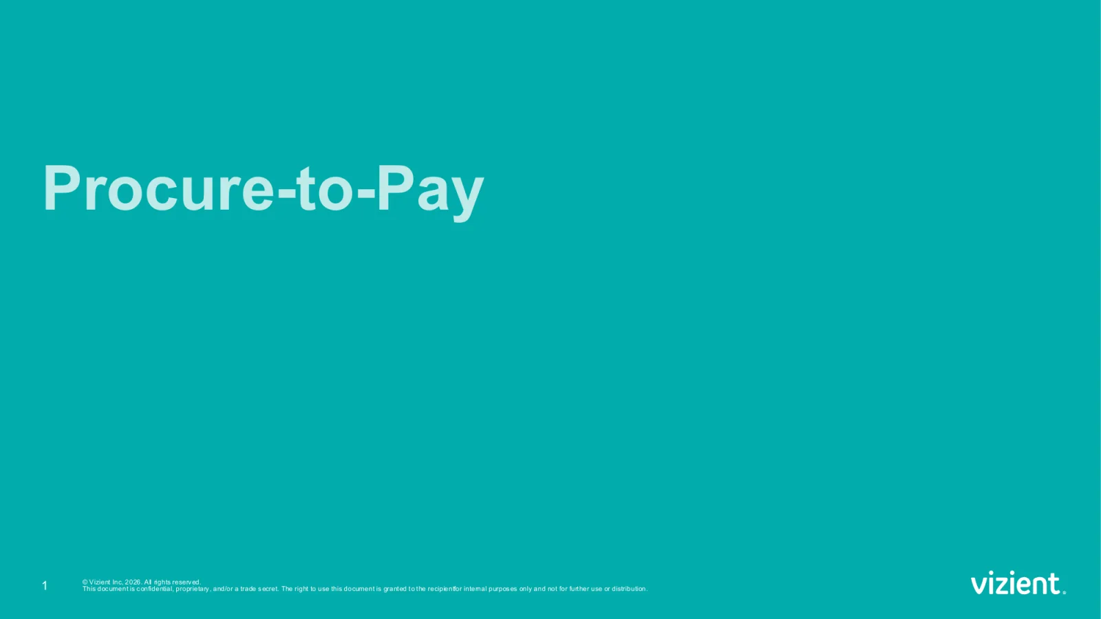
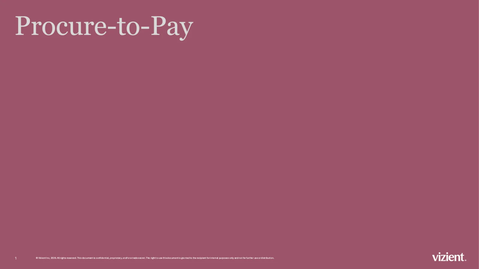
Procure-to-Pay, the deck that sells Vizient’s supply chain solutions, moved onto the new template too: 23 slides in, 28 out. One teal used to carry every slide. Now each section gets its own color from the palette, and every title moves to Georgia Pro. Look through the lens to see each slide change.
 OriginalRedesign in the lens
Cover
Teal and a heavy sans give way to Mauve and Georgia Pro, set on the template's title line.
Move across the slide to steer the lens. Click or tap to open it fully.
The 250-slide master deck, rebuilt slide by slide. Drag the handle to compare the legacy version with the redesign, or step through the deck.
Slide 001 / 250
The system did not stay in PowerPoint. For Vizient’s data and digital strategy campaign I designed animated display ads and square social ads in the campaign’s teal and violet, built on the same type, photography, and overlapping circles as the rest of the brand. Each one also plays as a Mulberry study, to show how the work sits inside the master brand.





 As shipped
300 × 250 display ad
Each social ad pairs two photos in overlapping circles: what the data already shows, and what comes next.


 Campaign teal
Where you’ve been, and where the market is going.
Clinical data as the foundation, market foresight as the next layer.
The ads shipped in the campaign’s teal and violet. The Mulberry versions are a recolor study: the same photos, type, and layout brought back into the master brand, with Mauve in the overlap where the two circles meet.
A template only holds up if people know how to use it. These rules went into the guide that ships with the deck.
Tell a story.
Every deck needs one big idea the rest of the slides support. Decide what the audience should do or feel when it ends.
When everything is important, nothing is.
Keep each slide to its main points and leave the narrative for the talk track. Less on the slide keeps attention on the speaker.
Icons at one size, one weight.
Icons drawn at the same size, width, and stroke keep a slide from looking assembled from different decks.
Align to the logo.
Content on the left lines up with the logo, content on the right with the slide number. The grid decides where everything sits.
Narrow the measure.
Headlines and body copy run narrower and slightly condensed, so lines are easy to read and never collide with charts or images.
Make it accessible.
Every color pairing was checked against WCAG contrast guidance, and Blush and Peach are kept to accents, never text backgrounds.
A brand teams can actually use.
The refresh shipped as a working system: a template library, a user guide, two icon libraries, chart and color rules, a rebuilt master deck, and more than 1,000 assets made through automated workflows. Teams can now build on brand without starting from a blank slide.
Next work
Amazon Web Services